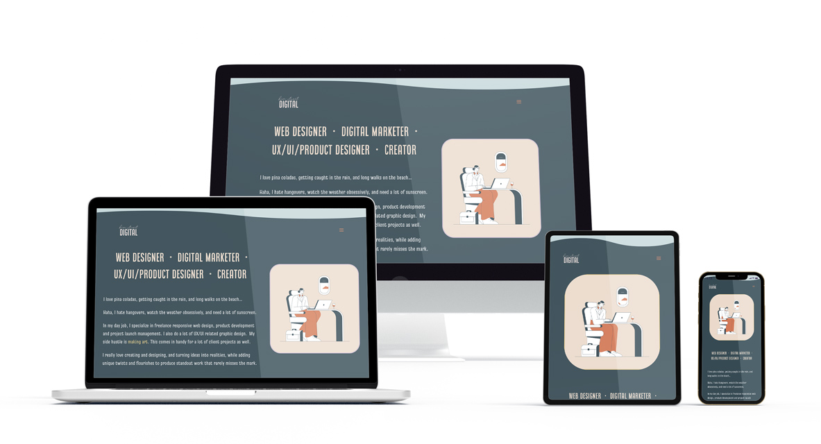
Responsive Design:
A User-Centric Approach to the Web
The landscape of web browsing has undergone a dramatic shift. No longer are desktops the sole domain of internet exploration. With the proliferation of smartphones, tablets, and other mobile devices, users expect seamless and optimized experiences across a variety of screen sizes. This is where responsive design (RWD) steps in, offering a solution that caters to this diverse user base.
Understanding Responsive Design

Flexible Images & Media
Fluid Grids & Layouts
CSS Media Queries
The User Experience Advantage
The Necessity of Responsive Design for Good UX

In today’s mobile-first world, responsive design is a fundamental requirement for good UX.
A website that adapts to the user’s device fosters a sense of control and enhances engagement. Users are more likely to spend time on a website that feels intuitive and caters to their specific context, whether they’re on a desktop at work or browsing on their phone during their commute.
Responsive design greatly reduces the time spent on maintenance and upgrades. Previously, websites required separate versions for desktops and mobile devices. This meant double the work for developers and content creators. Responsive design eliminates this redundancy, saving time and resources while ensuring a consistent user experience across all platforms.
Avoiding Common Pitfalls: Optimizing Content for Responsive Design
While responsive design offers a plethora of benefits, there are pitfalls to avoid in order to maximize content visibility and user engagement:
Overly complex layouts – complex layouts with intricate nesting can become unwieldy on smaller screens. Responsive design should aim for simplicity and clarity, ensuring content hierarchy and user flow remain clear across all devices.
Excessive text blocks – dense walls of text can overwhelm users on mobile devices. Breaking up content into smaller, digestible chunks with clear headings and subheadings improves readability on smaller screens.
Unoptimized images – large, high-resolution images can lead to slow loading times, especially on mobiles with limited bandwidth. Optimize images for the web by resizing and compressing them to ensure fast loading speeds.
Neglecting mobile-specific features – responsive design doesn’t simply mean shrinking content. Consider implementing touch-friendly features such as larger buttons and tap targets, and leverage device-specific functionalities like click-to-call buttons or geolocation features for a more intuitive mobile experience.
Forgetting about testing – responsive design is an iterative process. Thoroughly test your website across a variety of devices and screen sizes to identify and rectify any layout issues, usability problems, or display inconsistencies. Tools like browser developer tools and device emulators can be invaluable in this process.
Prioritizing Content
for
Responsive Design
Beyond technical considerations, responsive design requires a strategic approach to content presentation.
Prioritizing Content
for
Responsive Design
Beyond technical considerations, responsive design requires a strategic approach to content presentation.
Taking Responsive Design Beyond the Basics
While core principles remain constant, responsive design is an evolving field; here are some additional considerations to stay ahead of the curve:
Performance Optimization: Fast loading times are critical for a positive user experience, especially on mobile devices. Implement techniques like lazy loading for images and minification of code to ensure optimal website performance across all platforms.
Progressive Enhancement: This approach focuses on delivering a basic user experience on all devices, with additional features progressively added for more capable devices. This ensures a smooth experience for everyone, regardless of their browsing platform.
Future-Proofing Your Design: The landscape of technology is constantly changing. By employing responsive design principles, you create a website that can adapt to future devices and screen sizes without a complete overhaul.
Responsive design is not just a technical consideration; it’s a strategic approach that prioritizes user experience in a device-agnostic world.
By embracing responsive design principles, you can create a website that caters to all users, regardless of their chosen platform. This translates to increased user engagement, improved search engine ranking, and ultimately, a successful online presence.
In addition to the points mentioned above, here are a few final thoughts.
User research drives design – understanding your target audience and their browsing habits is crucial. Conduct user research to identify the devices your users favor and tailor the responsive design experience accordingly.
Without A/B testing, it’s impossible to refine your site – once your website is responsive, don’t stop there. Utilize A/B testing to experiment with different design elements and content layouts to see what resonates best with your users on various devices. By continuously testing and refining your responsive design, you can ensure an optimal user experience for all visitors.
By following these guidelines and staying informed about the latest trends in responsive design, you should expect to have a website that delivers a seamless and positive user experience for all visitors, regardless of the device they choose.
Let's talk.